




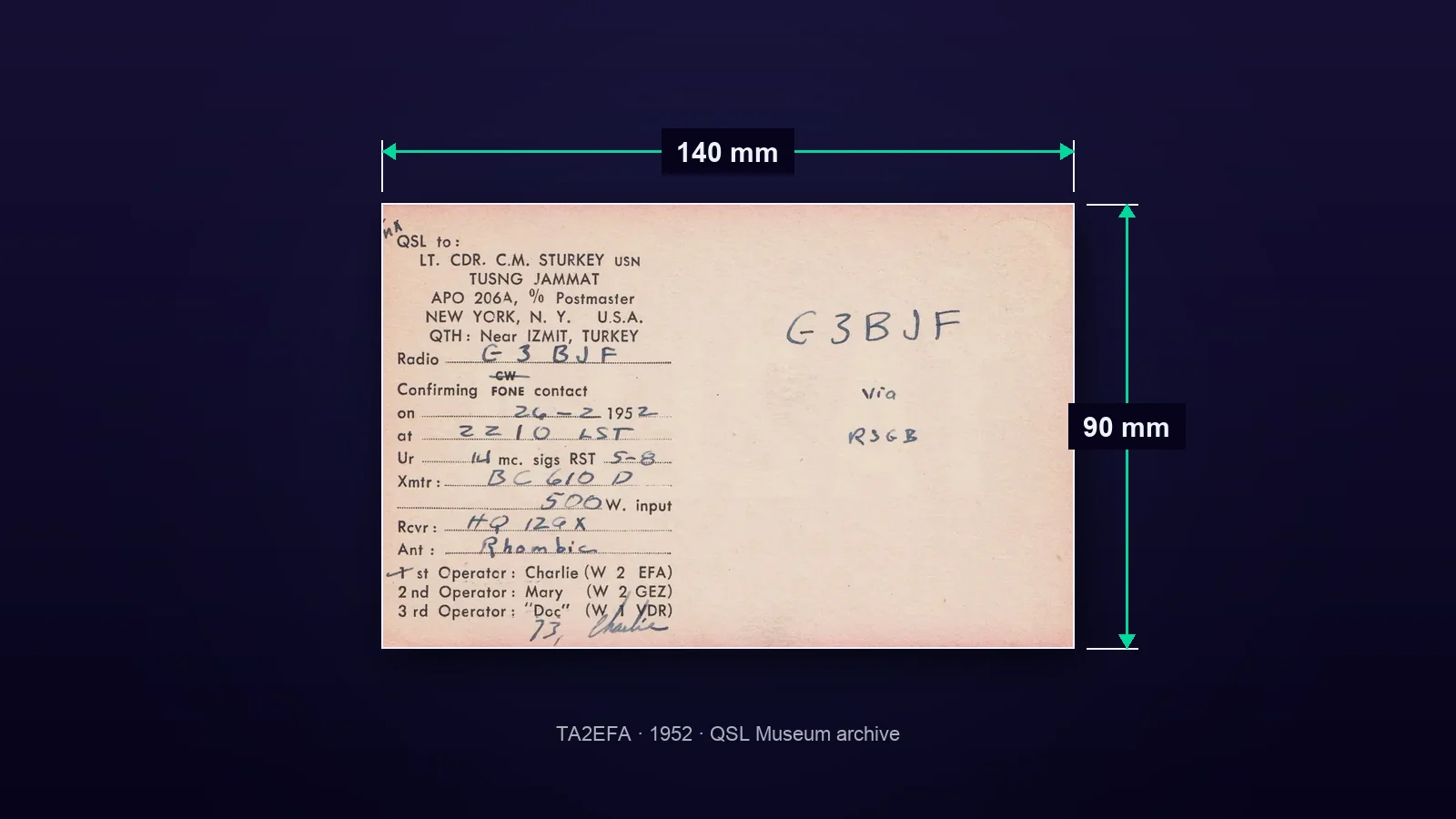
The international standard recorded in the archive for a QSL card is 140 × 90 mm; the card should weigh no more than 3 grams. A smaller card may be used, but larger cards make sorting, mailing, boxing and bundling more difficult. Begin the design with this limit, then plan the fields needed to confirm the contact.
QSL card size: 140 × 90 mm
The QSL Museum’s page on QSL card dimensions and standards gives the size as 140 × 90 mm, with an imperial equivalent of 5.5 × 3.5 inches. The same source records a maximum weight of 3 grams. These two values determine not only how the design looks on screen, but also how the printed card should be prepared.
When setting up the print file, treating 140 × 90 mm as the finished card size is a practical starting point. Text, images and contact fields must fit within this surface. The option to make a smaller card does not mean every element should be reduced; legibility and spaces intended for handwriting must be preserved.
The archive page does not specify bleed, paper stock or printing method, so it would be misleading to assign a single figure to them. Before sending the file to print, ask the chosen printer for its trim and safe-area requirements. This keeps the archive-verified finished size separate from the printer’s production specifications.
Judging the card only on screen can also be deceptive. Printing a proof at finished size makes it possible to inspect the actual scale of the callsign, small text and fill-in fields. This is not a claim from the archive, but a practical design step for checking the limited 140 × 90 mm surface before printing.
What information needs space on the card?
A QSL card is a physical document that confirms a contact, or QSO. According to the archive description, it includes the band or frequency used, time, date, report and mode. The information layer of the design can be built around these fields:
- The other station’s callsign
- Band or frequency
- Time of the contact
- Date of the contact
- Signal report
- Mode, such as SSB or CW
The order of these items is a design choice. Keeping the callsign distinct from the contact fields, however, makes the card easier both to complete and to examine later in an archive. Treating the visual identity and the record area as separate blocks offers a clear solution.
On the TA1AR Yalçın Kılan page, the fronts and backs of cards dated 1992 and 1993 can be viewed together. This record makes it possible to compare designs from different years for a single callsign and see how both sides were used.

How can the front and back be divided?
The archive includes cards shown on one side only as well as cards whose front and back are documented separately. This variety shows that QSL design cannot be reduced to a single layout formula. The front may carry the visual identity, while contact details can occupy an orderly area on the same side or be placed on the back.
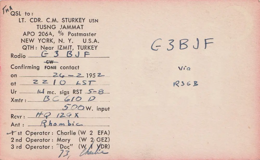
The TA2EFA Charles M. Sturkey page contains two QSL cards dated 1952 and 1953. It also records that Mary Sturkey served as the second operator at station TA2EFA and that this was noted on the back of the card. The example shows how operator information can be more than decoration: it can complete the card’s documentary character.
On TA1AC Çetin Şener’s card, the “Mode: CW” field is fixed. The archive page states that Çetin Şener operated only in CW. This is a real example of information that can be printed permanently during the design stage when a station’s operating practice does not change. Variable details still need enough space to be entered by hand.
From a ready-made postcard to a custom design
A QSL card does not always have to be a custom print designed from scratch. The W0SO/TA3 Philip W. Morrell page explains that cards used under TA3SO were made by overprinting postcards produced by TWA. The W0SO card dated 26 April 1947 in the same archive record bears Turkish stamps postmarked Ankara and a Turkish Red Crescent charity stamp. The page also explains that AM in the phrase “TNX QSO AM” under “Remarks” means Air Mobile.
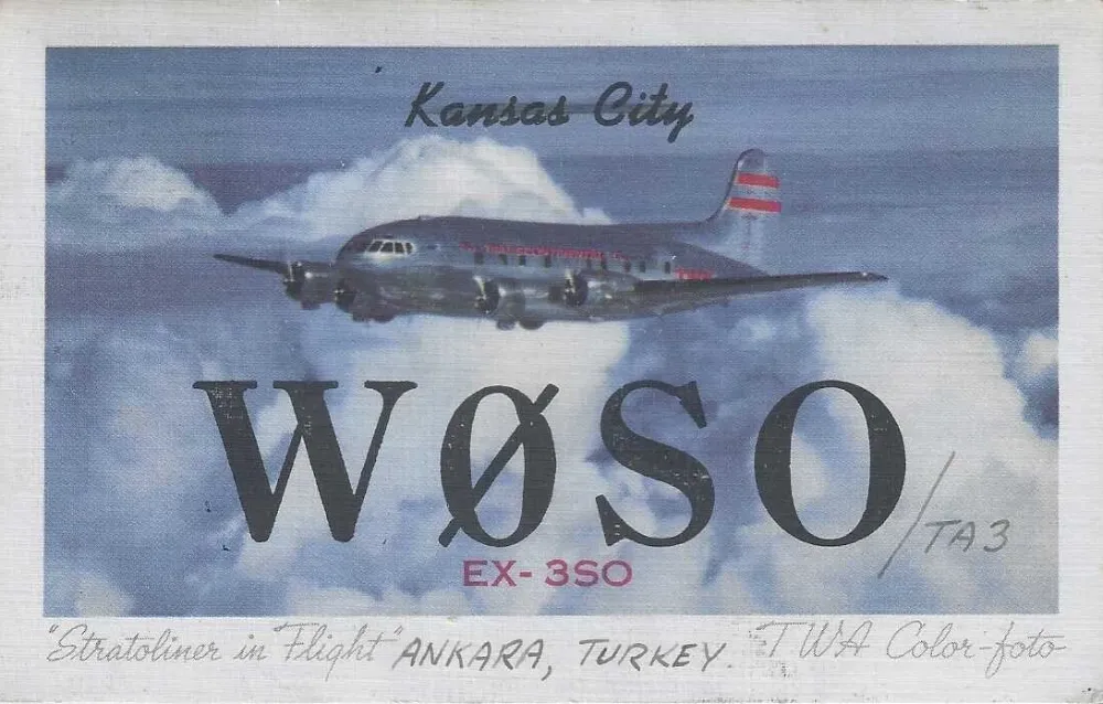
This example is a reminder that design is more than colour and typography. The surface of a ready-made postcard, added printing, a remarks field and postal elements can together form a single document. When preparing a new card, space for the station’s location, operating practice or operator details can likewise become the part of the design that carries its story.
Short pre-press checklist
- Set the finished card size to 140 × 90 mm.
- Keep the card’s weight at no more than 3 grams.
- Place the callsign where it is easy to notice.
- Include complete fields for band or frequency, time, date, report and mode.
- Separate fixed printed information from variable fill-in fields.
- Decide the roles of the front and back before printing.
- Ask the printer separately about trim and safe-area requirements.
- In the final check, make sure blank fields can be filled in legibly by hand.
The shared lesson of these archive examples is that size establishes the frame, while the arrangement of information, operator details and chosen visual approach create the card’s identity. A good QSL card records the contact clearly while preserving the station’s distinctive trace.